
CSS PLAY
Doing It With Style
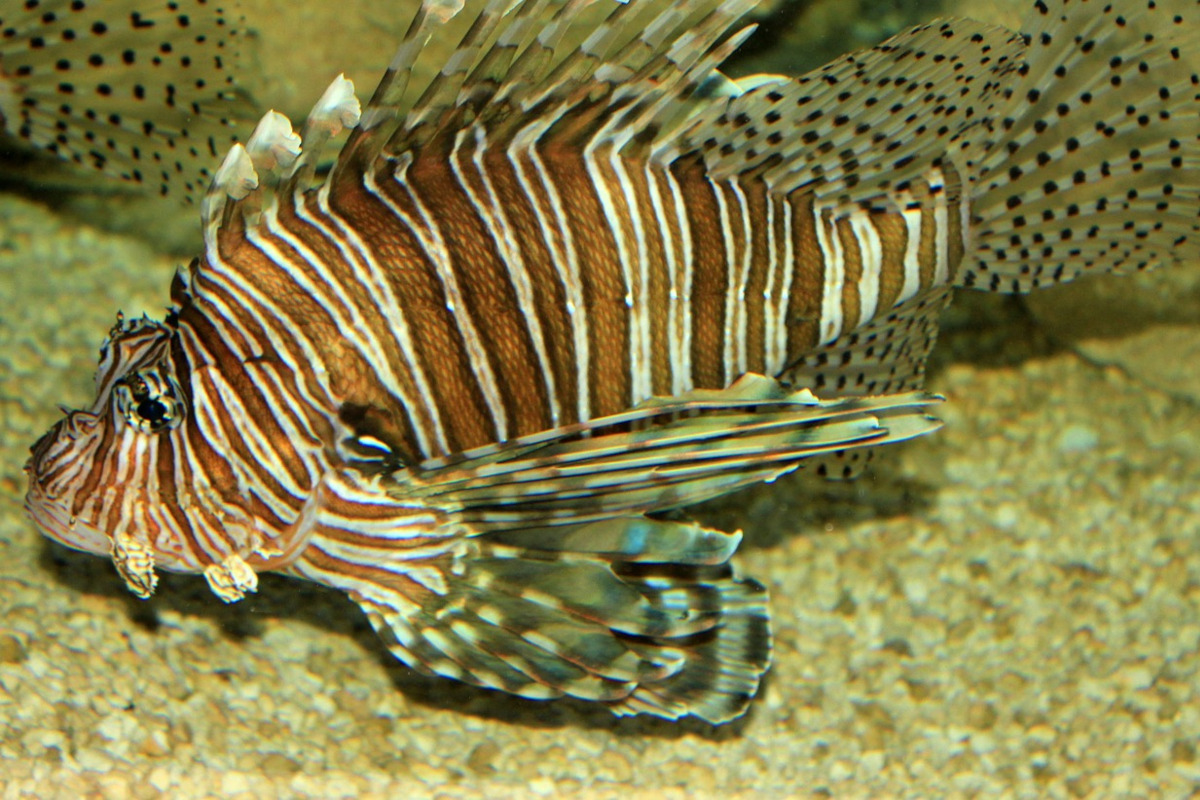
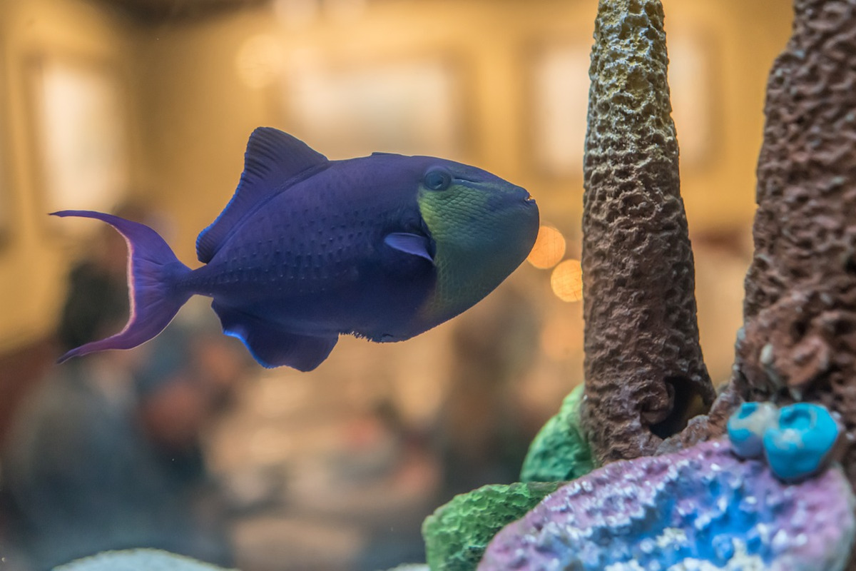
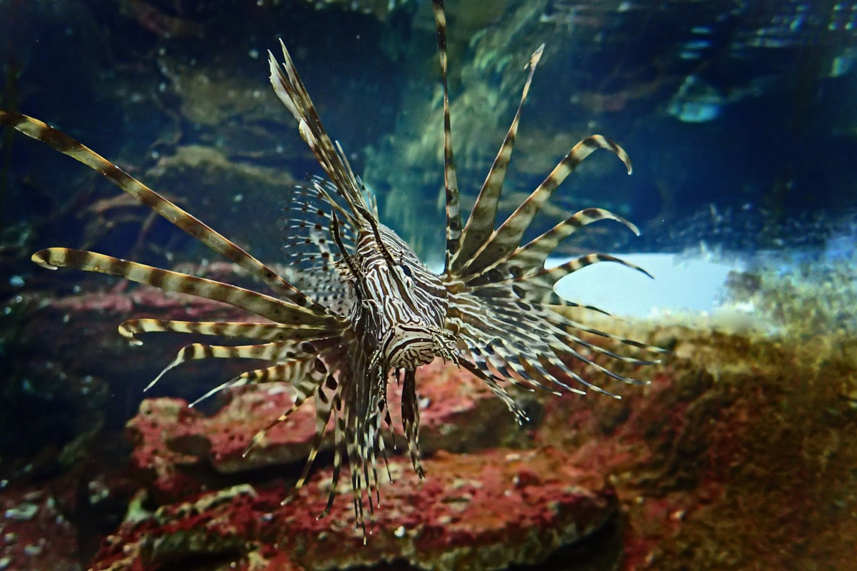
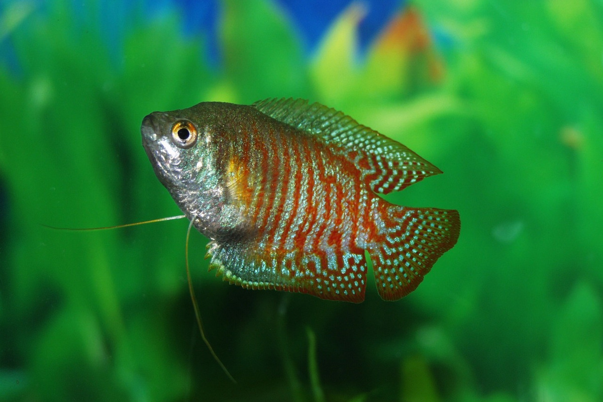
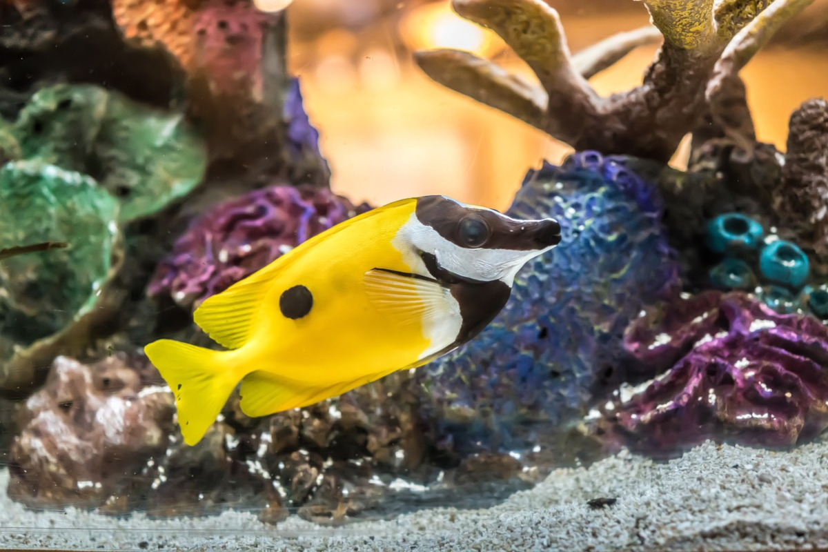
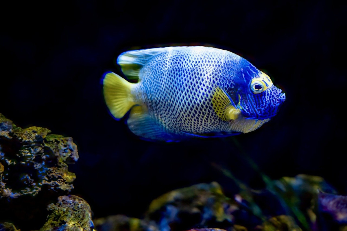
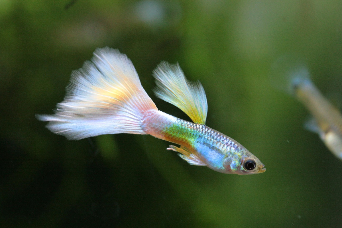
This is the third in the 'HOW TO' series of demonstration giving more information and methods of producing HTML/CSS carousel / slideshows.
The above demonstration is about as simple as it gets to produce a responsive, manual controlled carousel / slideshow using minimal HTML and CSS.
The HTML is the same as the HOW TO #1 - Auto run carousel with the addition of the radio inputs and the two divs id="buttons" and id="arrows".
<div id="outer">
<input type="radio" id="p1" name="slides" checked>
<input type="radio" id="p2" name="slides">
<input type="radio" id="p3" name="slides">
<input type="radio" id="p4" name="slides">
<input type="radio" id="p5" name="slides">
<input type="radio" id="p6" name="slides">
<input type="radio" id="p7" name="slides">
<div id="slide">
<div id="show">
<img src="fish2/fish1.jpg" title="" alt="">
<img src="fish2/fish2.jpg" title="" alt="">
<img src="fish2/fish3.jpg" title="" alt="">
<img src="fish2/fish4.jpg" title="" alt="">
<img src="fish2/fish5.jpg" title="" alt="">
<img src="fish2/fish6.jpg" title="" alt="">
<img src="fish2/fish7.jpg" title="" alt="">
</div>
</div>
<div id="buttons">
<label for="p1"></label>
<label for="p2"></label>
<label for="p3"></label>
<label for="p4"></label>
<label for="p5"></label>
<label for="p6"></label>
<label for="p7"></label>
</div>
<div id="arrows">
<label for="p7" class="left slide1"></label>
<label for="p2" class="right slide1"></label>
<label for="p1" class="left slide2"></label>
<label for="p3" class="right slide2"></label>
<label for="p2" class="left slide3"></label>
<label for="p4" class="right slide3"></label>
<label for="p3" class="left slide4"></label>
<label for="p5" class="right slide4"></label>
<label for="p4" class="left slide5"></label>
<label for="p6" class="right slide5"></label>
<label for="p5" class="left slide6"></label>
<label for="p7" class="right slide6"></label>
<label for="p6" class="left slide7"></label>
<label for="p1" class="right slide7"></label>
</div>
</div>
The CSS stylesheet for the basic carousel is the same as for the HOW To #1 but, because it is not auto running, the animations styles and @keyframes are not required. So these have been removed.
Because this does not use @keyframes animation we need to set a transition for the movement of the carousel.
#show {display:flex; flex-wrap:nowrap; height:100%; position:relative; left:0; transition:1s;}
The CSS styles for the control of the manual switching of the slides is as follows.
Move the radio inputs off screen
#outer input {position:fixed; left:-9999px; top:0;}
Position the buttons under the carousel images and center the labels using display:flex; gap:5px; justify-content:center;
#buttons {width:100%; height:10px; position:absolute; bottom:-20px; left:0; display:flex; gap:5px; justify-content:center;}
Style the button labels.
#buttons label {display:block; width:40px; height:10px; background:#888; cursor:pointer;}
#buttons label:hover {background:#000; transition:0.5s;}
Position the arrows each side of the carousel and vertically centered.
#arrows {position:absolute; top:50%; left:-35px; width:calc(100% + 70px); height:40px; transform:translateY(-20px);}
Set the size of the labels and have two sides with a black border. Hide all the arrows at the start.
#arrows label {display:none; width:20px; height:20px; cursor:pointer; border:10px solid #000; border-width:4px 4px 0 0;}
Stack the .left label on the left and rotate it -135 degrees to make it look like a left facing arrow.
#arrows label.left {position:absolute; left:10px; top:0; rotate:-135deg;}
Stack the .right label on the left and rotate it 45 degrees to make it look like a right facing arrow.
#arrows label.right {position:absolute; right:10px; top:0; rotate:45deg;}
Find which radio input is checked (#p1 is checked at the start when the page loads) and move the #show div to the left.
#outer:has(#p1:checked) #show {left:0;}
#outer:has(#p2:checked) #show {left:calc(var(--margin) * 1);}
#outer:has(#p3:checked) #show {left:calc(var(--margin) * 2);}
#outer:has(#p4:checked) #show {left:calc(var(--margin) * 3);}
#outer:has(#p5:checked) #show {left:calc(var(--margin) * 4);}
#outer:has(#p6:checked) #show {left:calc(var(--margin) * 5);}
#outer:has(#p7:checked) #show {left:calc(var(--margin) * 6);}
Find which radio input is checked (#p1 is checked at the start when the page loads) and show the correct set of arrows for the previous and next arrows.
#outer:has(#p1:checked) #arrows label.slide1,
#outer:has(#p2:checked) #arrows label.slide2,
#outer:has(#p3:checked) #arrows label.slide3,
#outer:has(#p4:checked) #arrows label.slide4,
#outer:has(#p5:checked) #arrows label.slide5,
#outer:has(#p6:checked) #arrows label.slide6,
#outer:has(#p7:checked) #arrows label.slide7 {display:block;}
Find which radio input is checked (#p1 is checked at the start when the page loads) and update the buttons to indicate the current slide.
#outer:has(#p1:checked) #buttons label[for="p1"],
#outer:has(#p2:checked) #buttons label[for="p2"],
#outer:has(#p3:checked) #buttons label[for="p3"],
#outer:has(#p4:checked) #buttons label[for="p4"],
#outer:has(#p5:checked) #buttons label[for="p5"],
#outer:has(#p6:checked) #buttons label[for="p6"],
#outer:has(#p7:checked) #buttons label[for="p7"] {background:#000;}